Answers Bible Series Maps
Project Goal
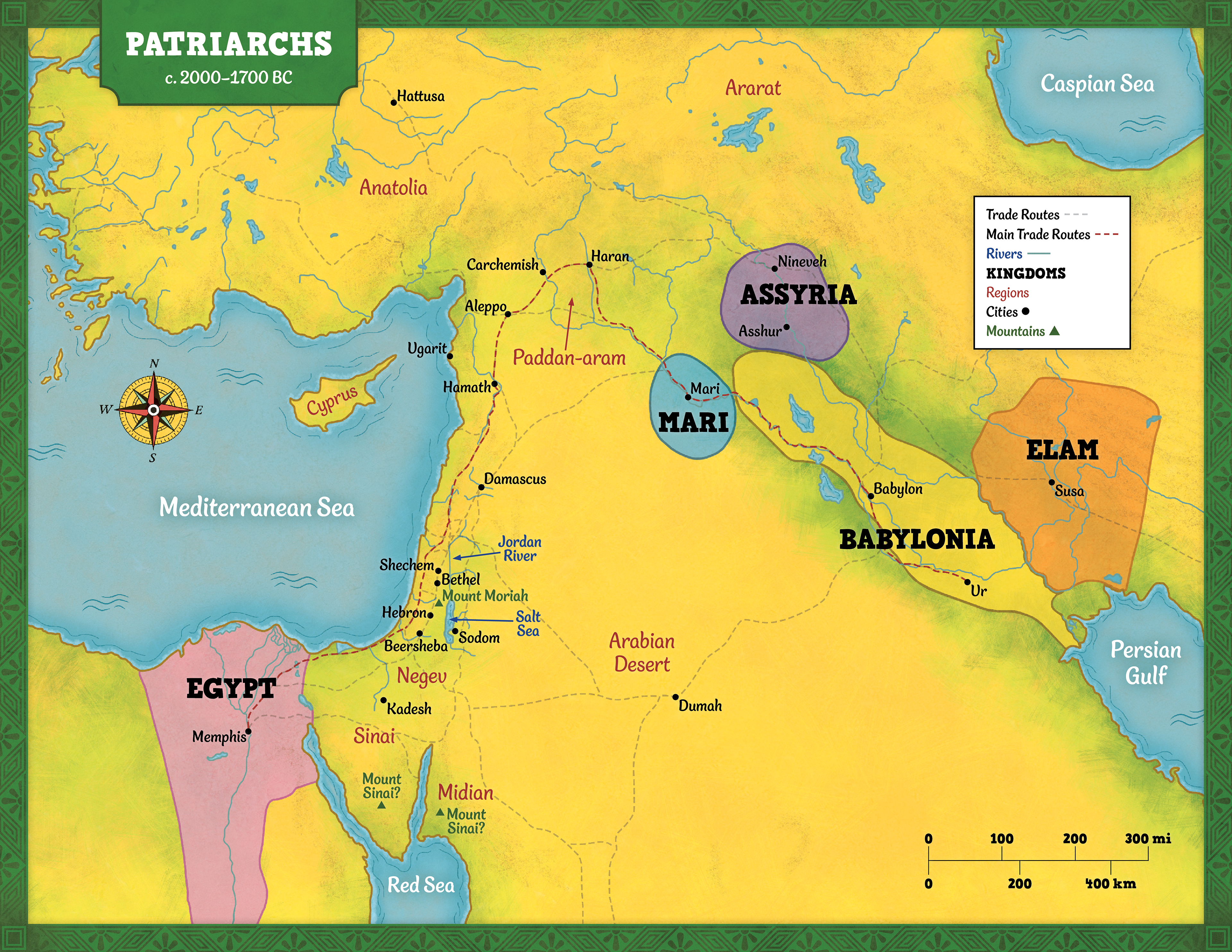
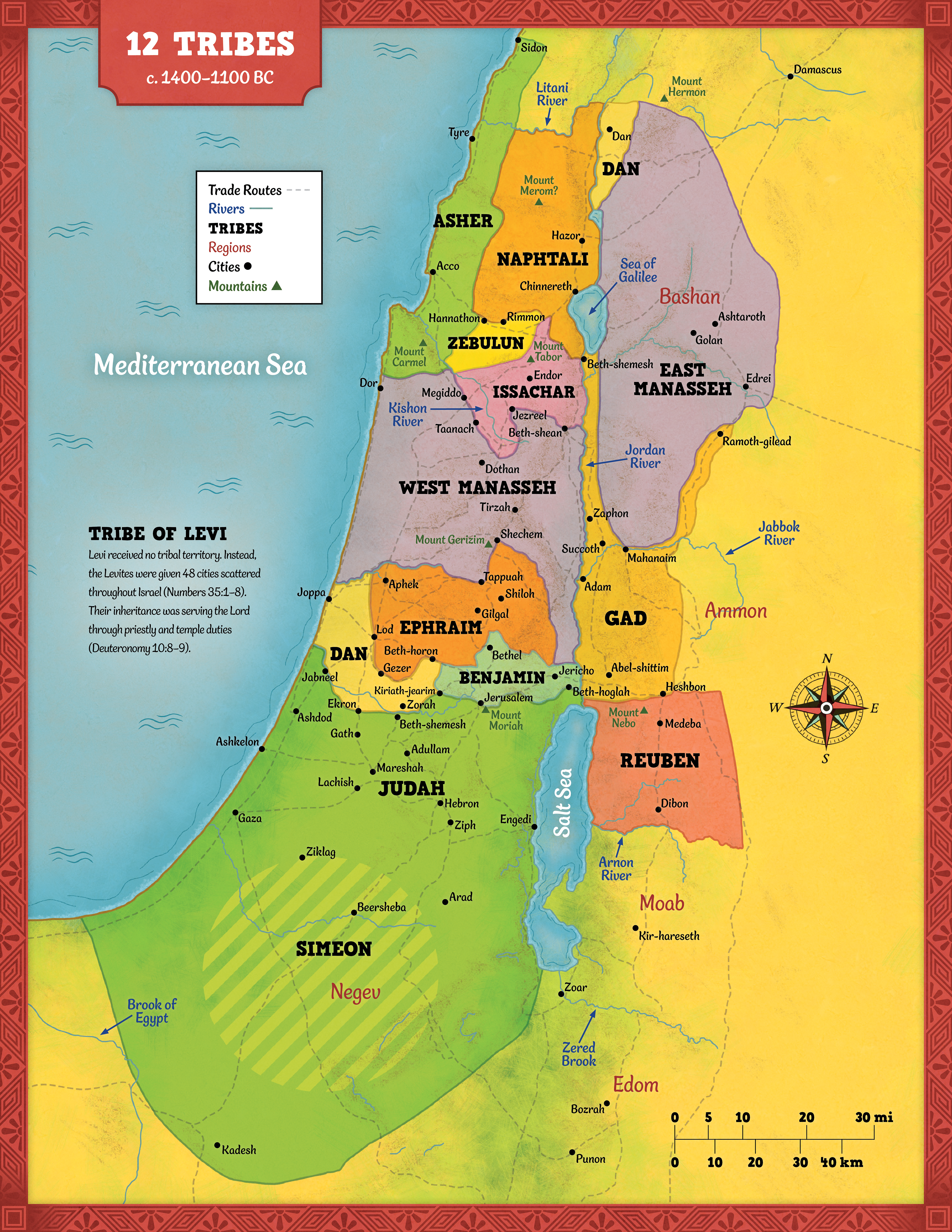
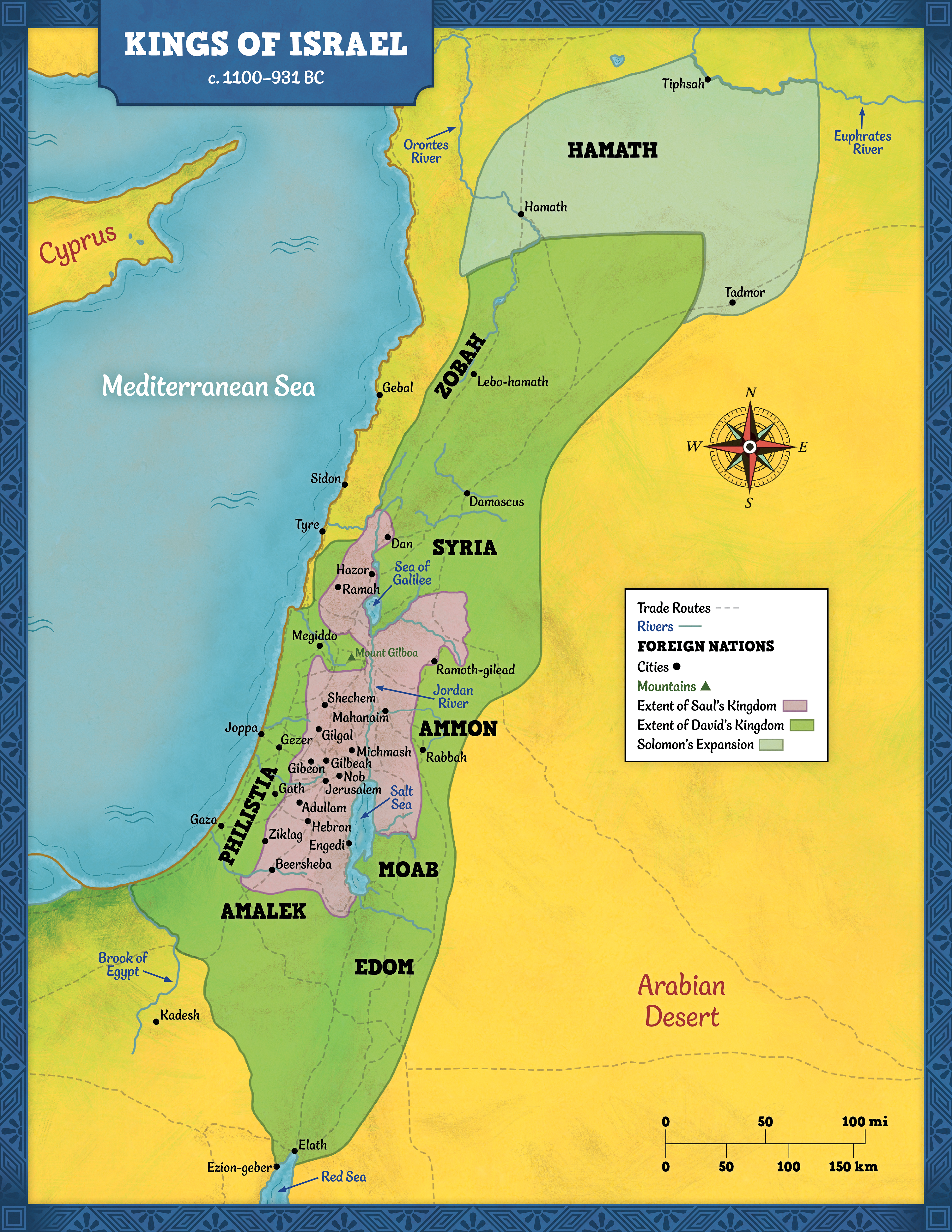
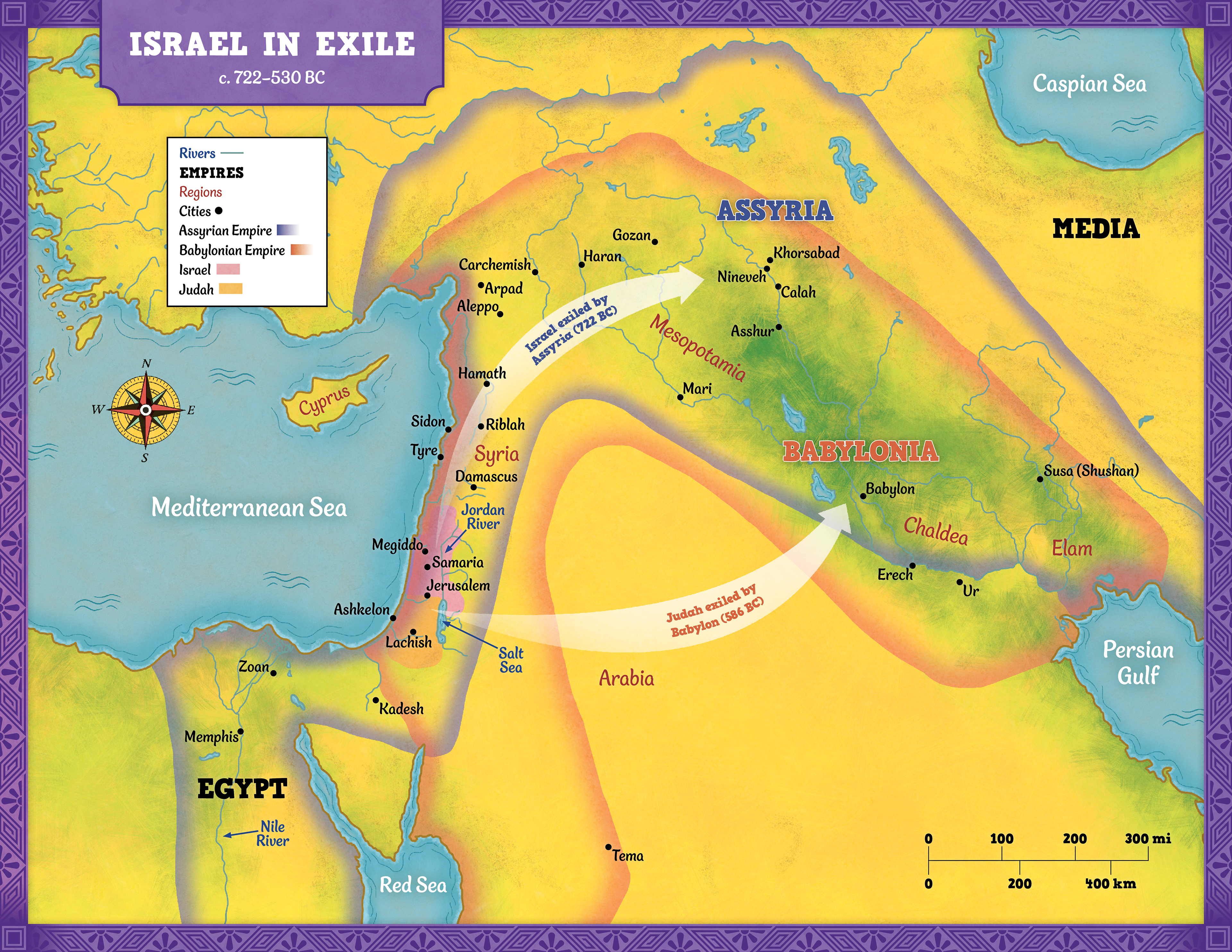
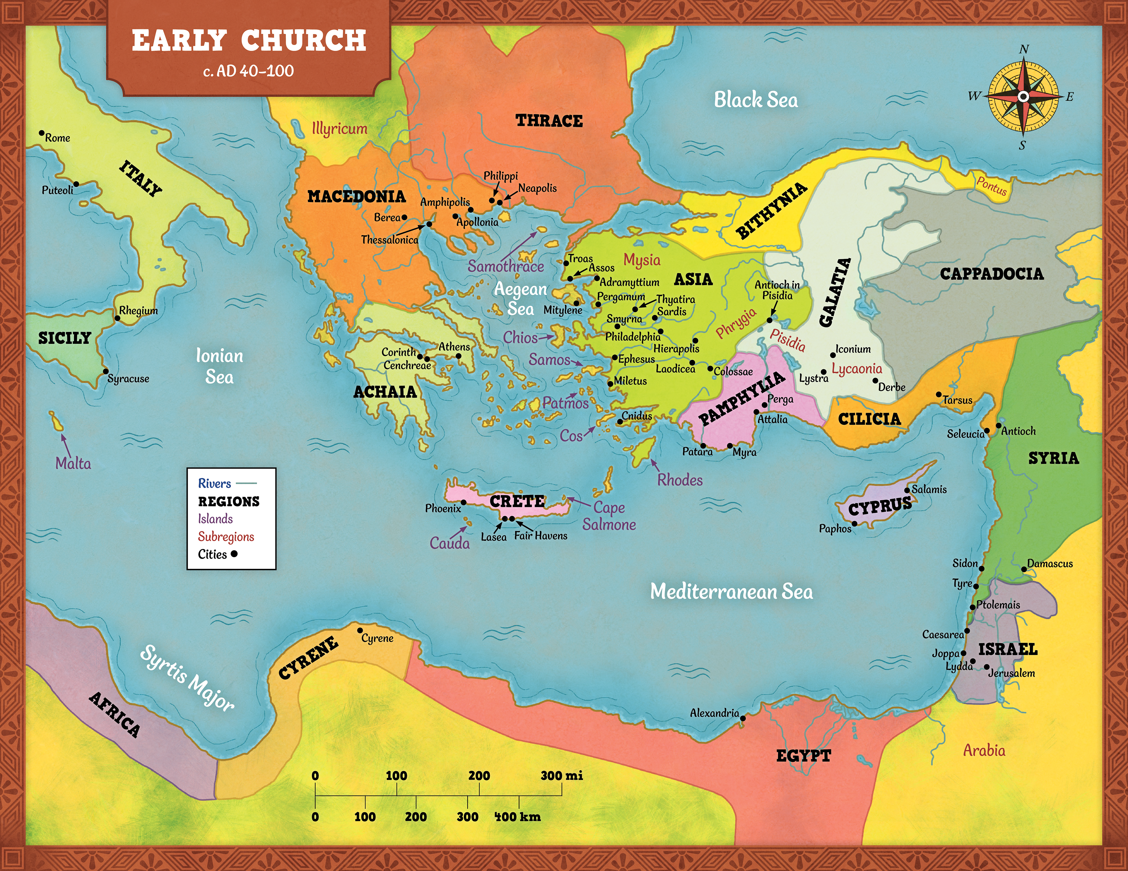
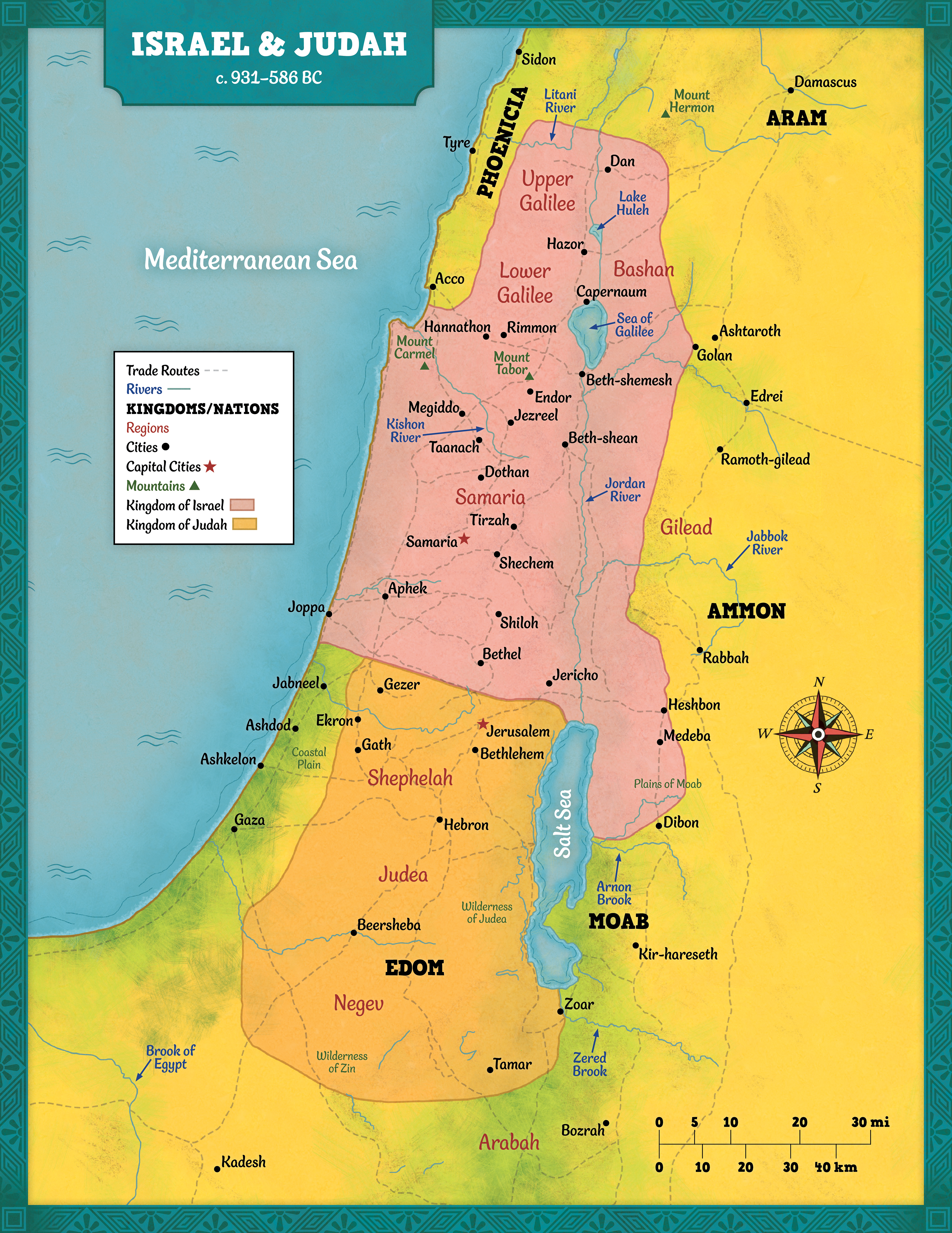
I was assigned the task of creating a series of maps for the upcoming Answers Bible Series for Answers in Genesis. These maps were to be centered around different time periods in which the different series timelines would be covering. These are 18x24 maps that could be used in classroom settings where the teacher can point to different points in the map as it aligns with the lesson.
Design Initiative
Since this map was primarily targeted toward kids, the map was to be colorful and full of life. So, I chose colors that would appeal to the audience and used references of other Bible maps while working with the writing team to accurate place different locations that align with the beliefs of Answers in Genesis. These maps were designed from scratch, from the outline to the placement of each location.
Timeline Posters
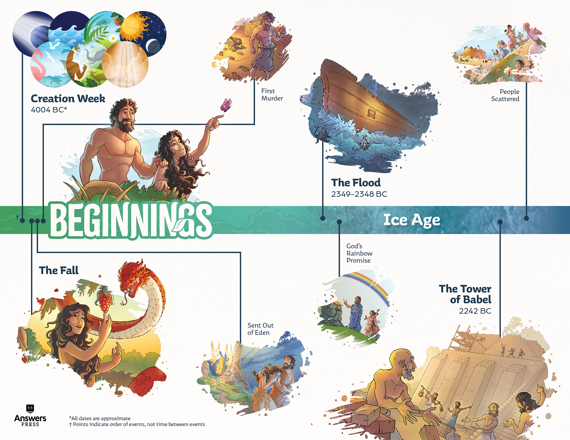
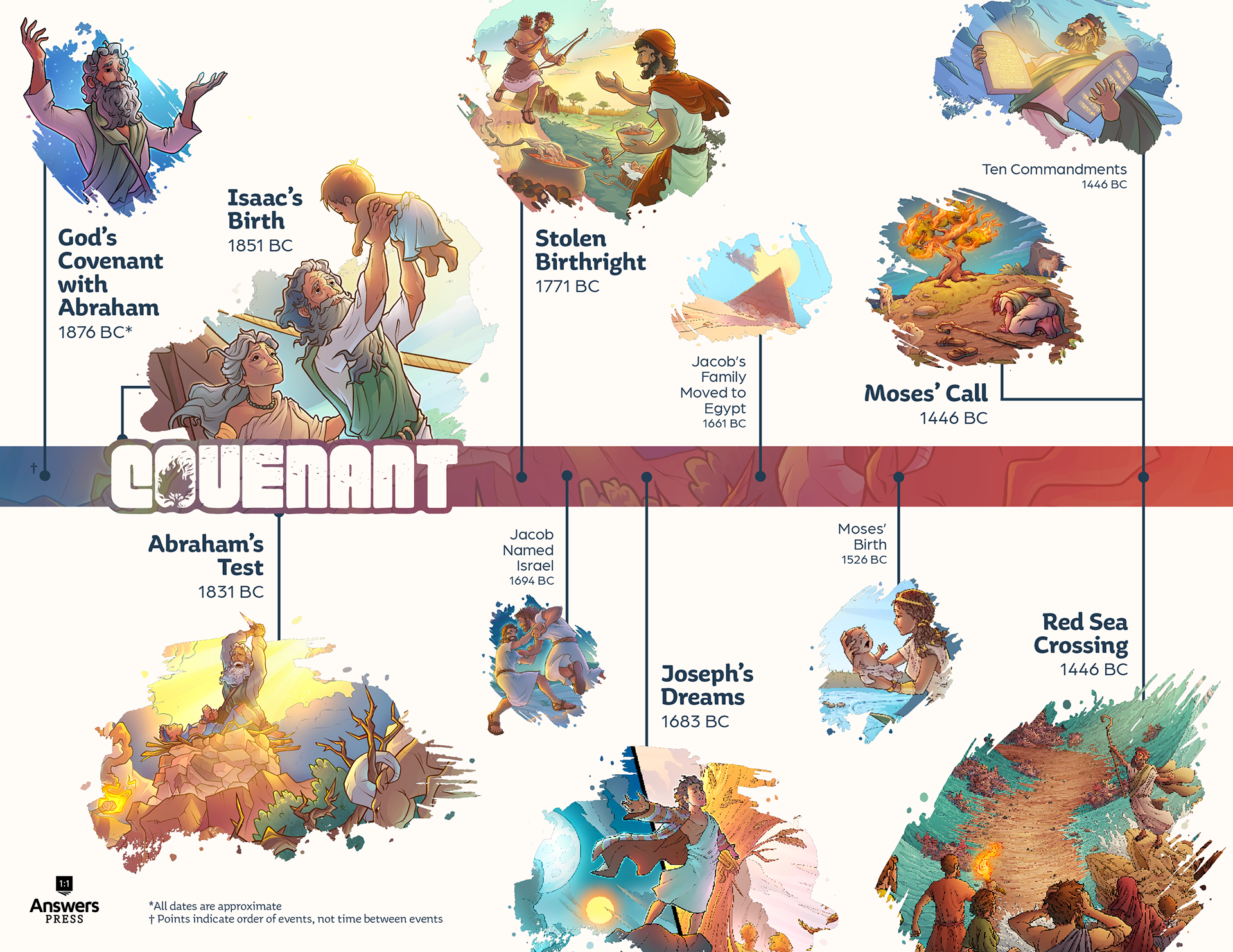
Project Goal
I was given the task to create a series of timelines using existing illustrations from our in-house illustrator that go with the timeline of events talked about in each series content. Since future series are still awaiting content, I was only able to finish the first two series. However, these two timeline posters pave the way for the creation of future series posters in the same style.
Design Initiative
The target audience of these timelines are kids grades K-8, allowing for these timelines to look very playful. To appeal to this target audience, I decided to use brush-like shapes to hold the illustrations with a colorful bar going through the middle that aligns with the brand color of each series.
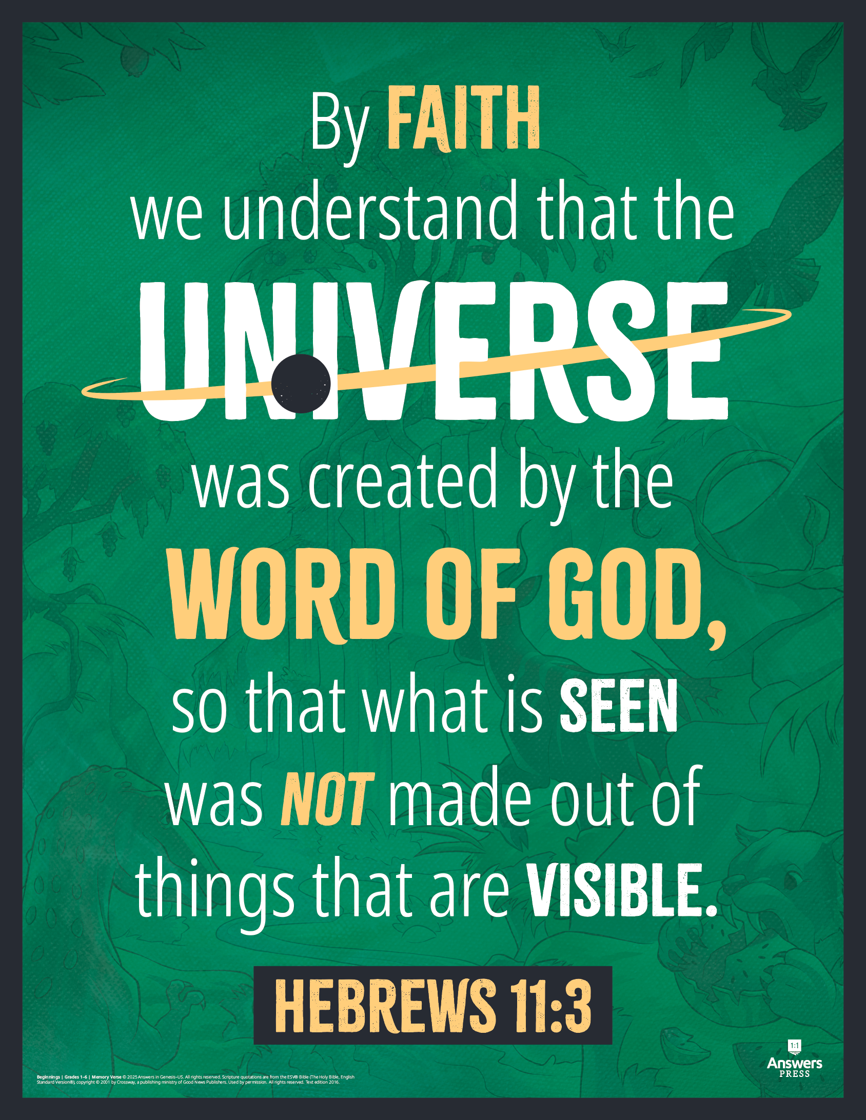
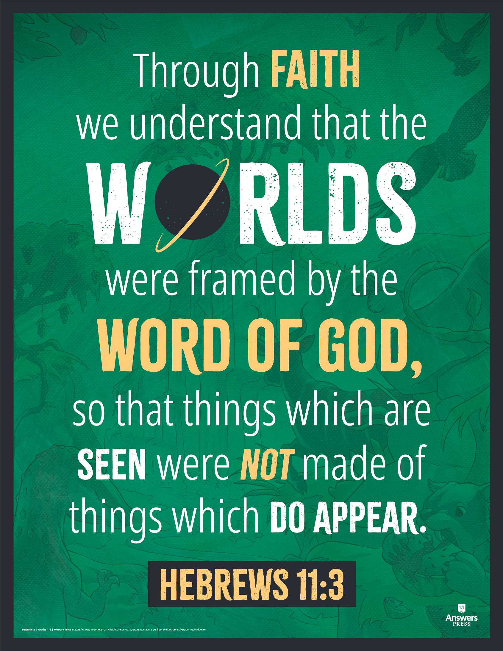
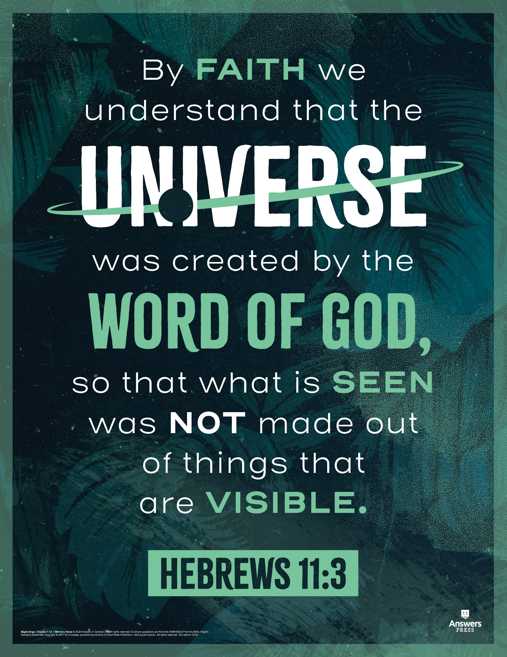
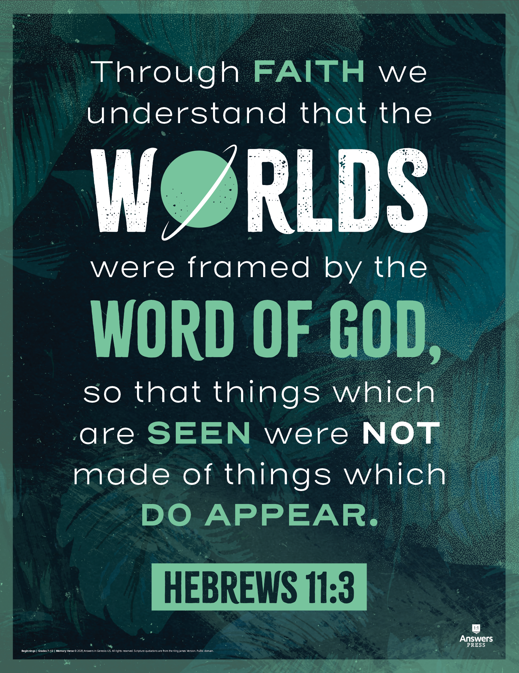
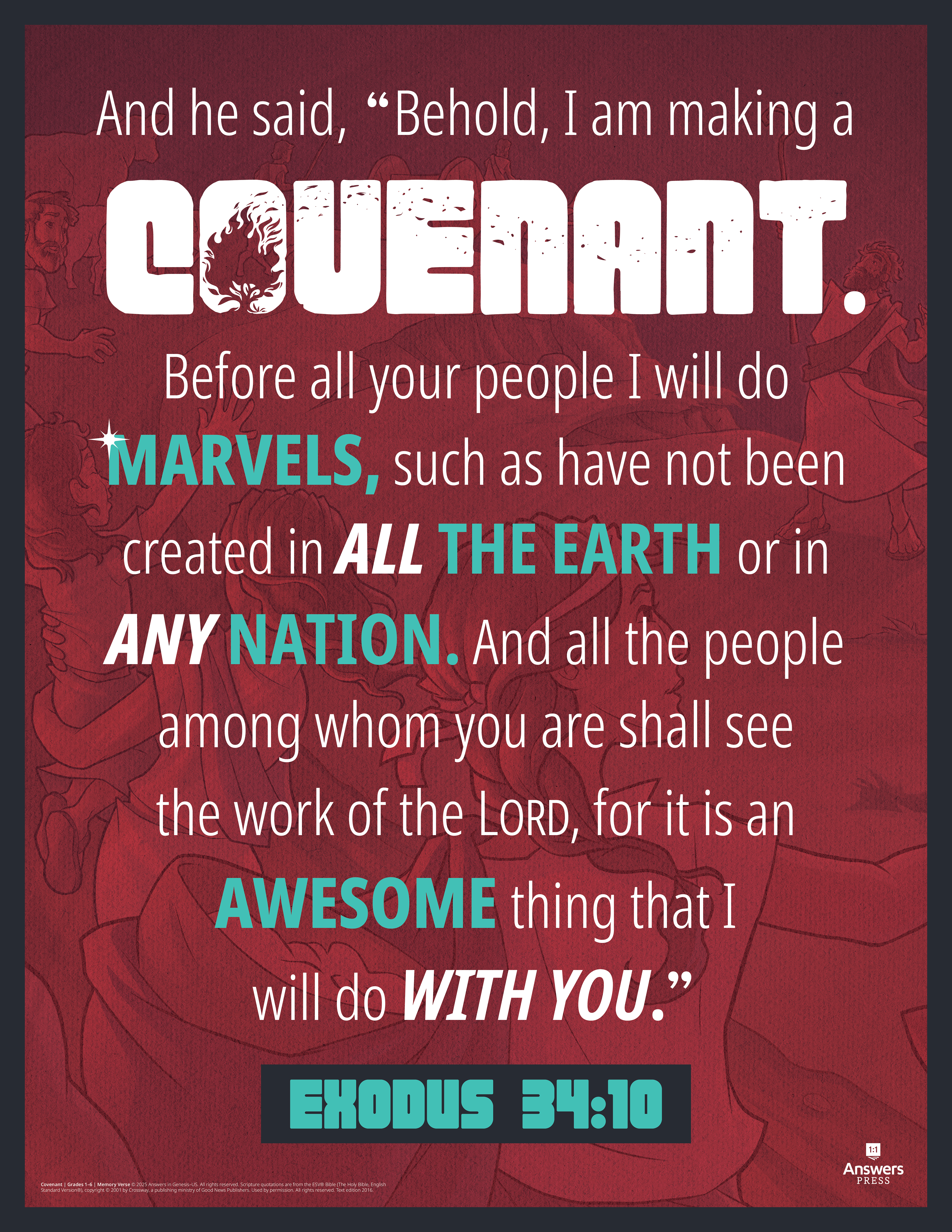
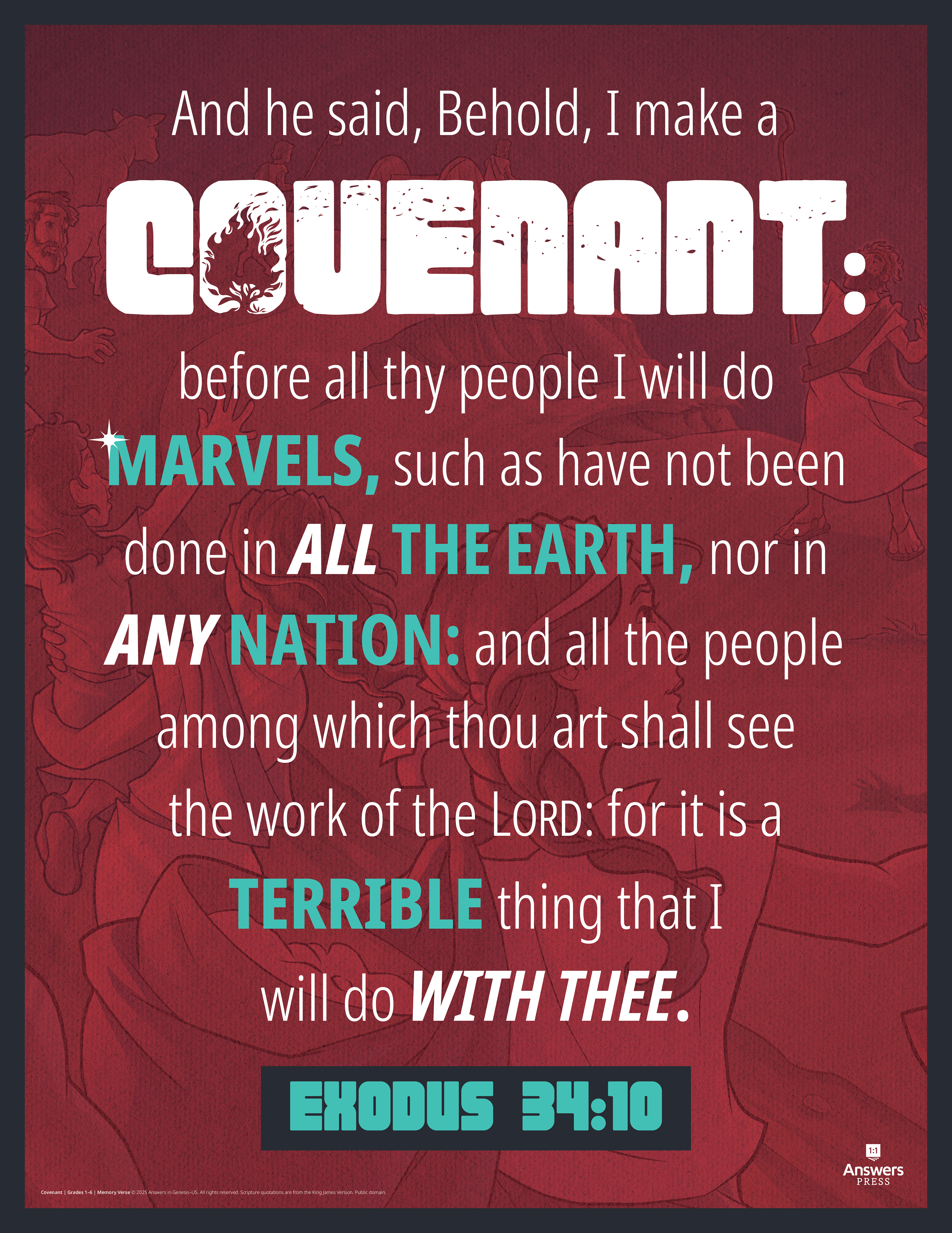
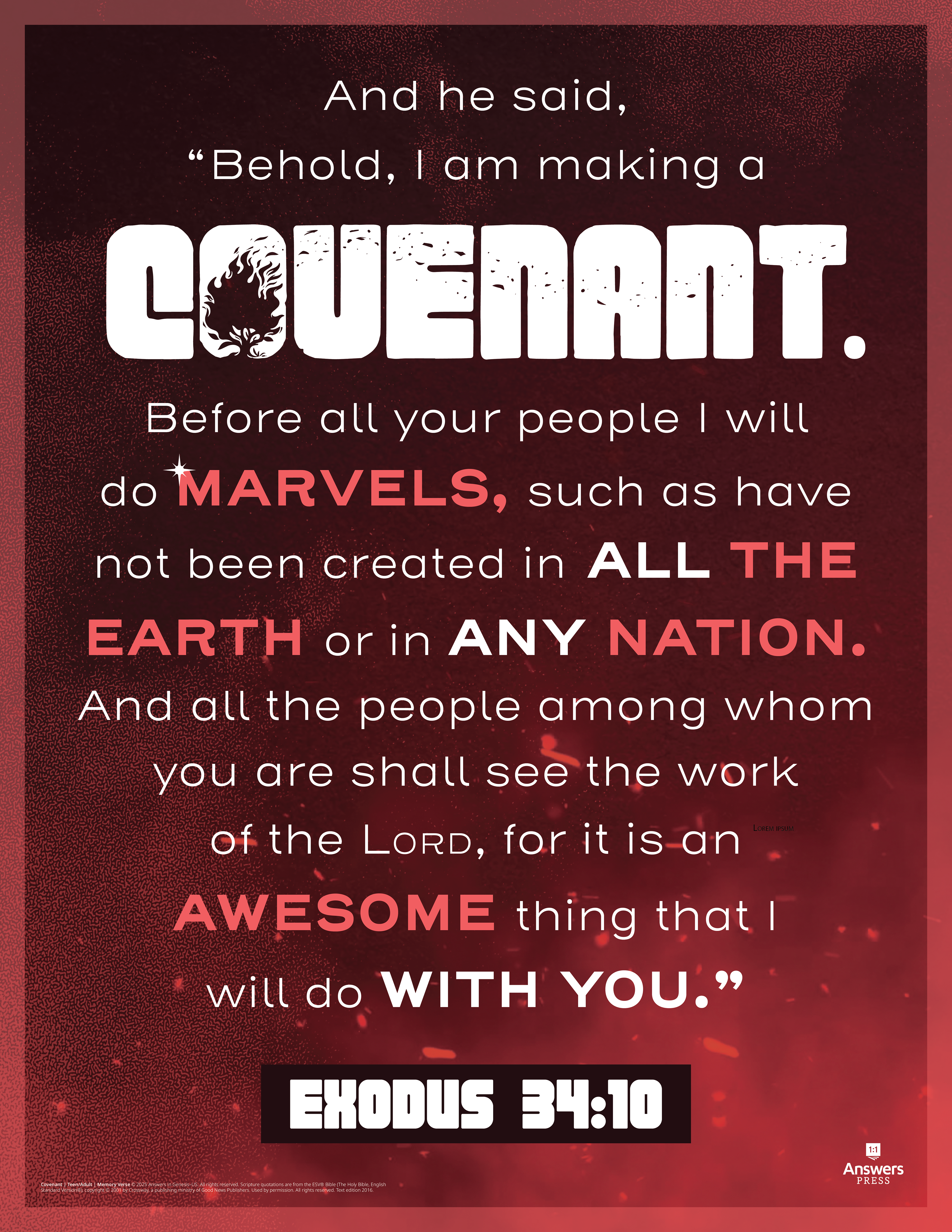
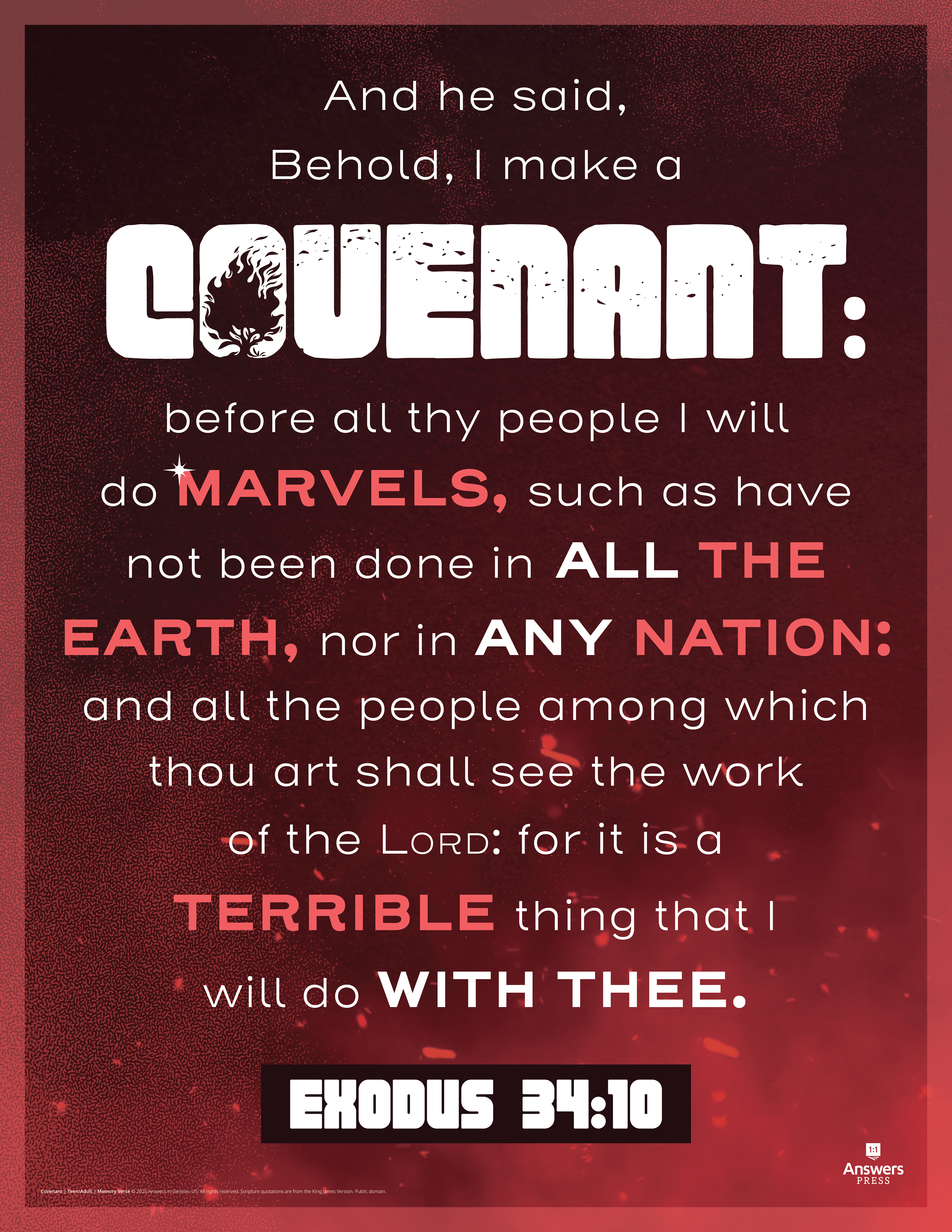
Memory Verse Posters
Project Goal
I was given the task to create memory verse posters that fit with the branding of each series. These posters were to be a typographic depiction of the memory verses that teachers could hang in their classrooms. Since future series are still awaiting content, I was only able to finish the first two series. However, these two memory verse posters pave the way for the creation of future series posters in the same style.
Design Initiative
These posters were to be front and back and have two different designs, one for kids and one for teens/adults. So, for each series, 4 memory verse posters were created. The front depicted the ESV version of the verse and the back depicted the KJV version. The goal was to use backgrounds/colors that mimic the branding for the kids and the teen/adult for each poster.